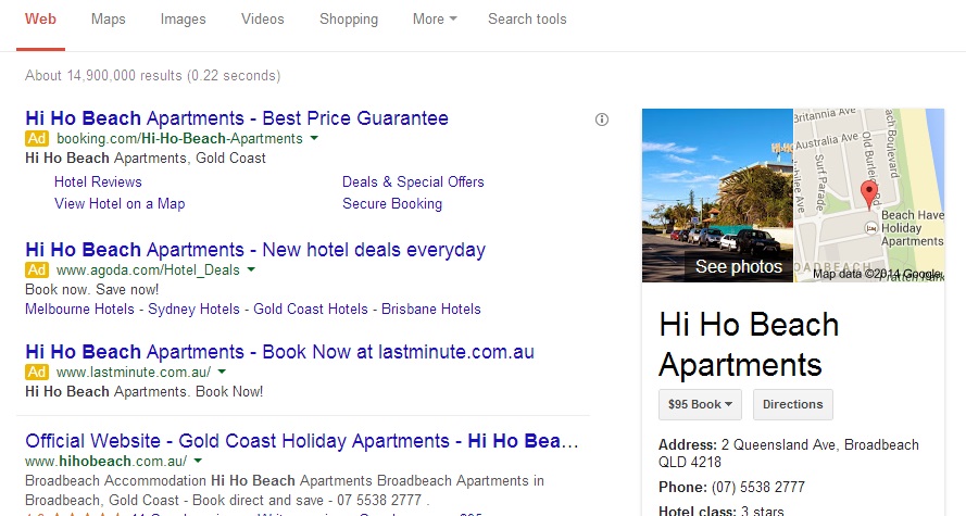
Noticed anything different about the Google search results lately? In the last few days the search company has begun rolling out a new design which changes the way organic search results and ads are displayed to desktop users.
Following similar changes Google made to mobile search last year, the new look removes underlines, increases the font size of search results, and perhaps most significantly, changes the way Google AdWords are identified. The revamp has removed the pink shading that previously distinguished ads from organic search results, replacing it with a simple, small yellow box labelled ‘ad.’
"It’s cleaner and simpler, optimized for touch, with results clustered on cards so you can focus on the answers you’re looking for," explained Google's senior vice president of search Amit Singhal in a recent blog post.
It seems some users started noticing the changes on desktop around November. However, Google has only begun rolling out the refreshed style on a wider scale recently, perhaps signalling their intent to create a more consistent experience for all users, no matter how they access search.
Have you noticed the recent changes to the Google search results pages? Let us know in the comments below!
RELATED PAGES AND BLOG POSTS:
– Goodbye Keyword Data, Hello Secure Search
– Bing Adds TripAdvisor Content to Search Results
– How Will Google Glass Change Online Marketing?

